My Photo Blog
Thursday, May 18, 2017
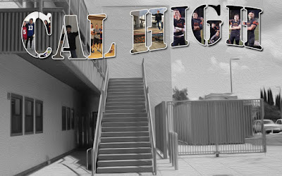
Cal High Post Card
What is your favorite image and what does it represent?
My favorite image is the one that I spread from the I to the H because it is a picture of me with all of my friends and it is a symbol of my friends and all the time we spent together.
What do you like about your postcard?
I like that I managed to get all of my friends on it and take pictures from meaningful events.
What could you have improved upon?
I could have spent a little more time moving my friends into better positions on the letter.
Explain what a layer mask does?
It is a tool on photoshop that can be used to hide certain aspects of a picture or reveal layers beneath the layer covered with a layer mask.
Friday, May 12, 2017
Advertising Project Carlos G, Claudio R, Bryan D & Trevor L
1.We used shoes as our product because we think that shoes are a cool product and thought they could make an interesting photo.
2. Our big idea was to highlight the shoes with a plain white background we were kind of successful, we did this by using layer masks to mask around the shoes and putting the same picture in the background that we desaturated all the way to make it as white as possible.
3. We used lighting from behind and the sides to attempt to adequately light up the shoes, we used some direct and diffused lighting. We shot against a white surface to highlight the color of the shoes.
Friday, April 28, 2017
Web quest Reflection
For this project I learned a lot about what it takes to make a good photo and how composition is important in doing this. I learned the rule of odds that a photo is more interesting when there are an odd number of subjects in an image. I also learned that the best kind of background to have is a simple one without anything that distracts from the subject. I learned that it can make an interesting picture if you fill up the frame with the subject. In addition to this I learned to try a lot of different angles and vantage points for a picture. Lastly I learned that in an action shot leaving space for a subject to go can make a picture better.
Wednesday, April 26, 2017
Monday, April 24, 2017
Still Life
1. What was your reason for your arrangement and background color?
The reason for may arrangement was to use the objects of a toy plane, small ice skates to tell a story about a little kid with their toys or something and I chose the background color because it looked cool.
2.How is the lighting in your image (direct, diffused, etc.)?
For the second and third pictures I used diffused lighting while for the first picture I used direct lighting.
3. What adjustments did you use?
I used hue and saturation adjustments, vibrance adjustments, levels, and brightness/contrast adjustment layers for all three and for the first one I used these adjustment layers and a desaturation to make it black and white.
4. How could you improve your composition?
I could improve my composition by taking a clearer picture and spending more time setting up the the lighting to make it look better.
Wednesday, April 12, 2017
Surreal Image
1. My image is about a stadium in the middle of the desert with a giant plant right next to it.
2. It was easy to find something were I could put stairs in the middle of the desert but it was hard to come up with a good idea.
3. I used layer mask tools, the brush tool and the polygon selection tool to isolate the parts of images that I wanted.
4. I could better blend and fit images into the picture better.
Monday, April 10, 2017
Ted Talk
What is the most important aspect when creating his work?
To make the photo look seamless and real, capturing an idea rather than an actual possible picture. They must have the same lighting and perspective to combine photos.
What do you find interesting about his work?
The way he is able to makes seeming realistic pictures that are impossible shots in reality.
Subscribe to:
Posts (Atom)